
Line 39 Wines
Unified by Design.
Packaging Redesign, Brand Architecture, Brand Tiering, Line Extensions
Role: Creative Director, Design
Agency: Kindred Creative Group

-
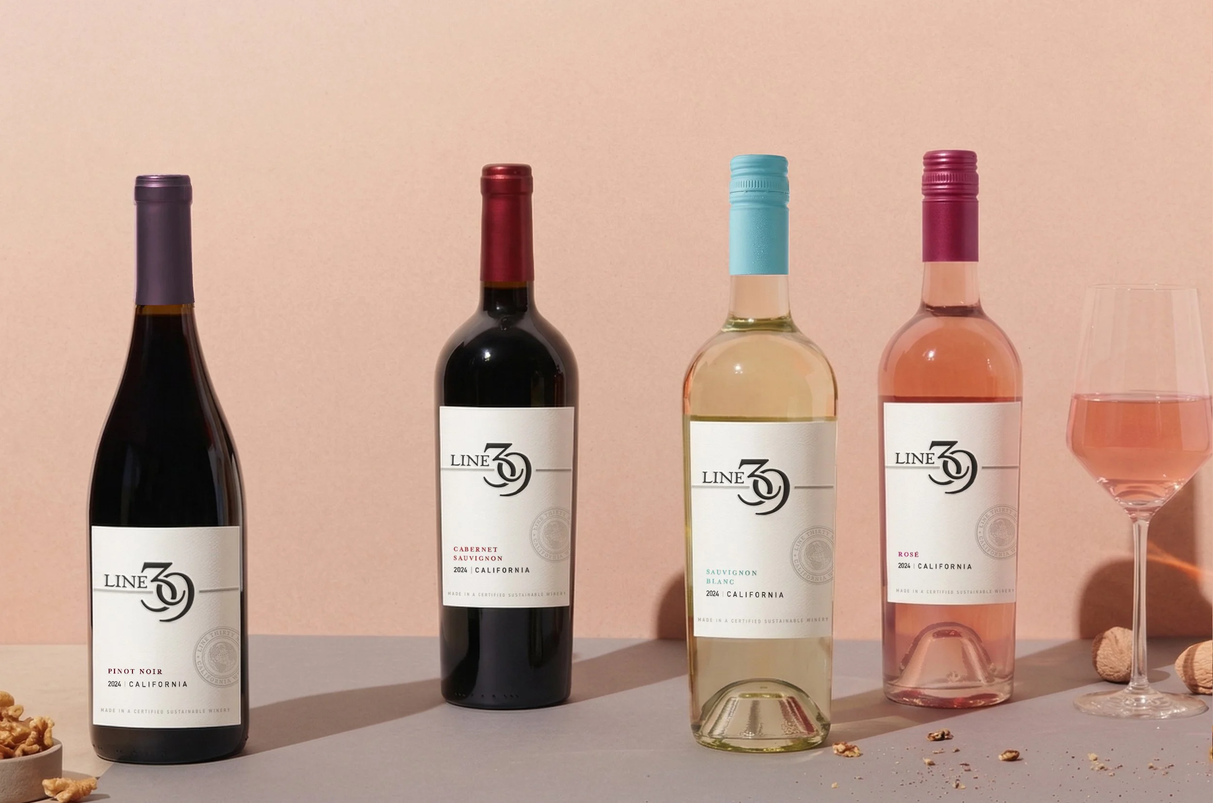
As Line 39 expanded its portfolio, the brand needed a cohesive packaging system to unify its core offerings. The challenge was to simplify and modernize the visual language without losing the brand’s uncomplicated, trustworthy character, ensuring consistency across an increasingly complex set of SKUs and price tiers.
-
The redesign established a disciplined, scalable system. A unified white label replaced a fragmented color-coded approach, creating stronger shelf presence. The logo was refined for better legibility, while a structured architecture enabled the launch of Organic, Low Alcohol, and Spritzer lines that feel distinct yet clearly connected to the core brand.
-
The refreshed system unified the portfolio and created a scalable platform for future innovation. With a clearer brand architecture in place, Line 39 reinforced its position as a trusted, proven leader in the category.
Before
After
A streamlined packaging system aligned the portfolio, creating a flexible platform for future growth.
Before
The core SKU redesign unlocked expansion into Organic, Low ABV, and specialty spritzer categories.
Ailm Estate

Title Nine
Beverage Expertise
Intercept Wines
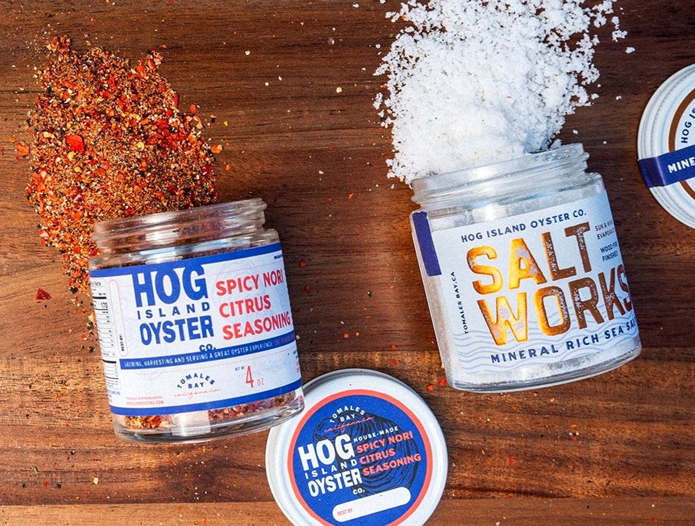
Hog Island Oysters
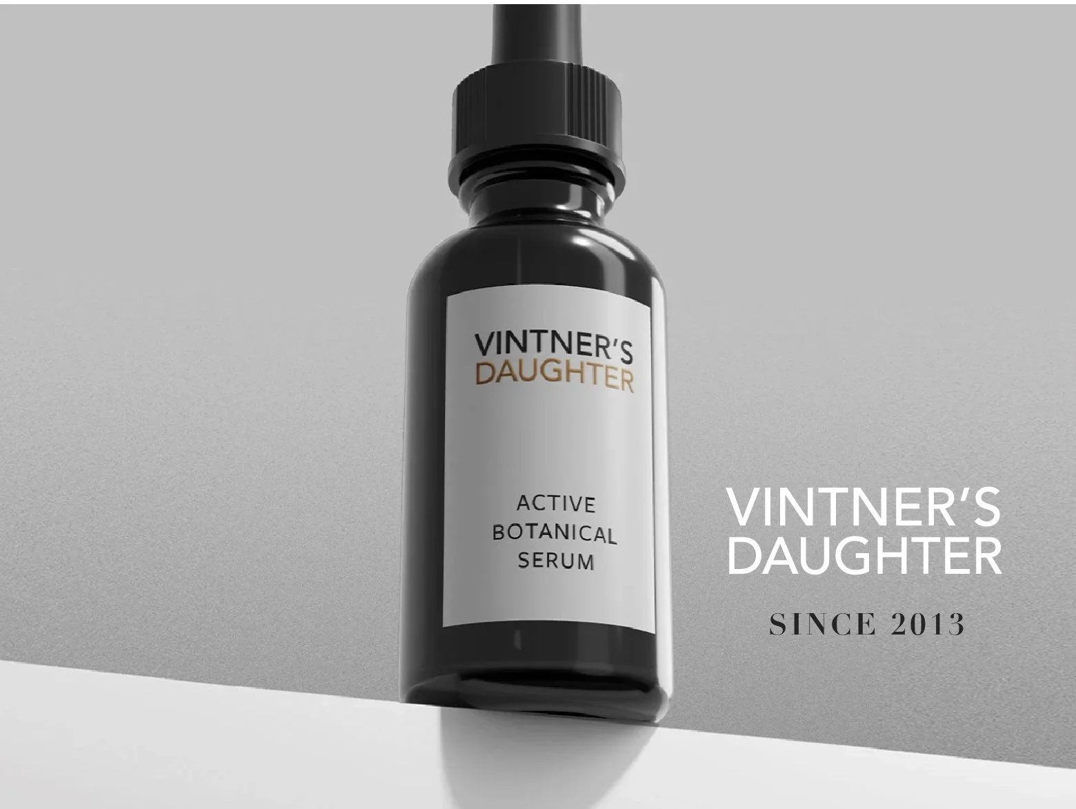
Vintner's Daughter
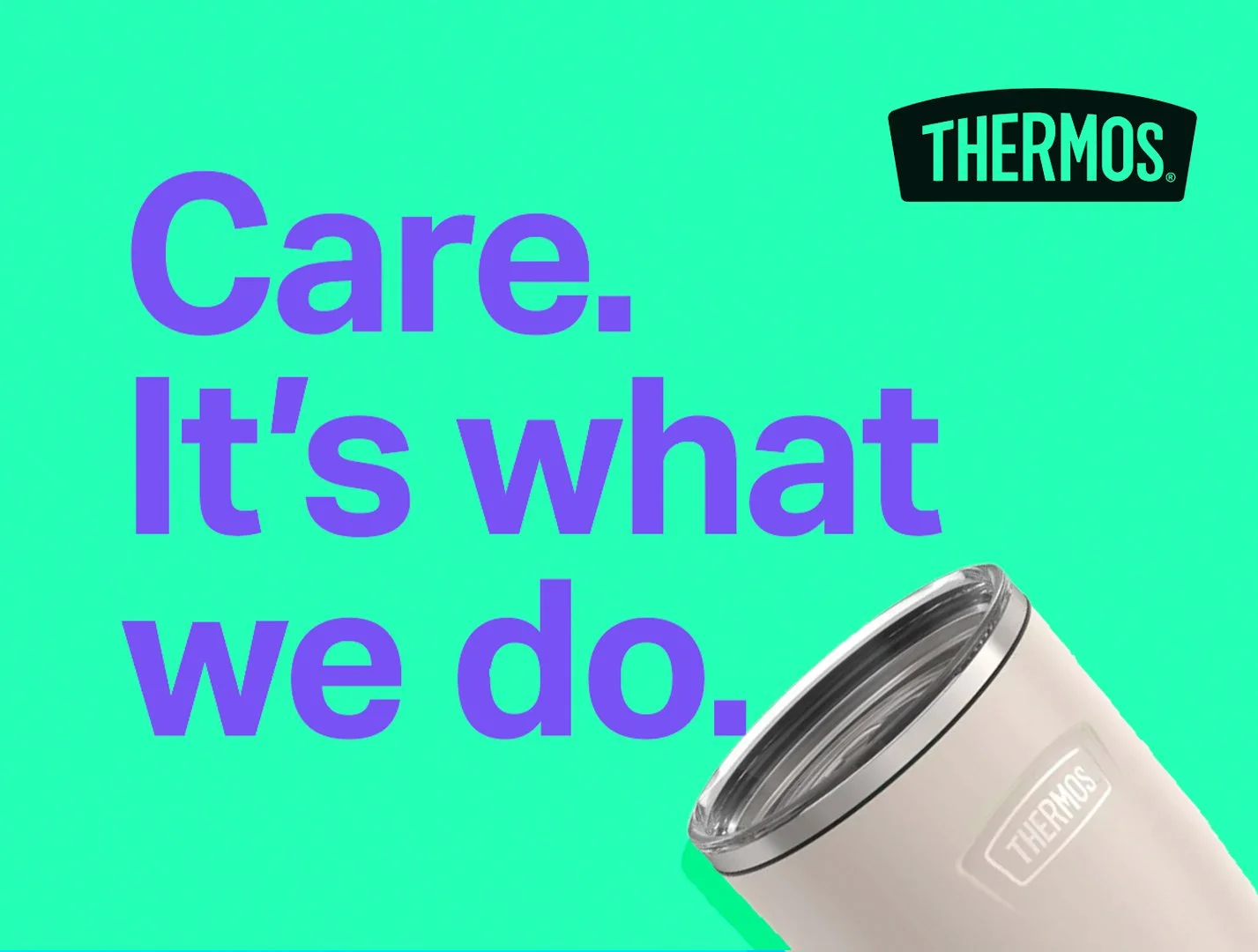
Thermos

Sundance